EDITORIAL DESIGN
In my university projects, I explored typography and editorial design through a minimalistic design approach, emphasizing clarity and reduction. At the same time, I carefully preserved the thematic character of each project, allowing the visual language to resonate with the content. This combination of restraint and contextual sensitivity creates a balance between functionality and expression, ensuring that typography not only communicates but also enriches the overall design.
ALLA SCOPERTA DI TRENTINO
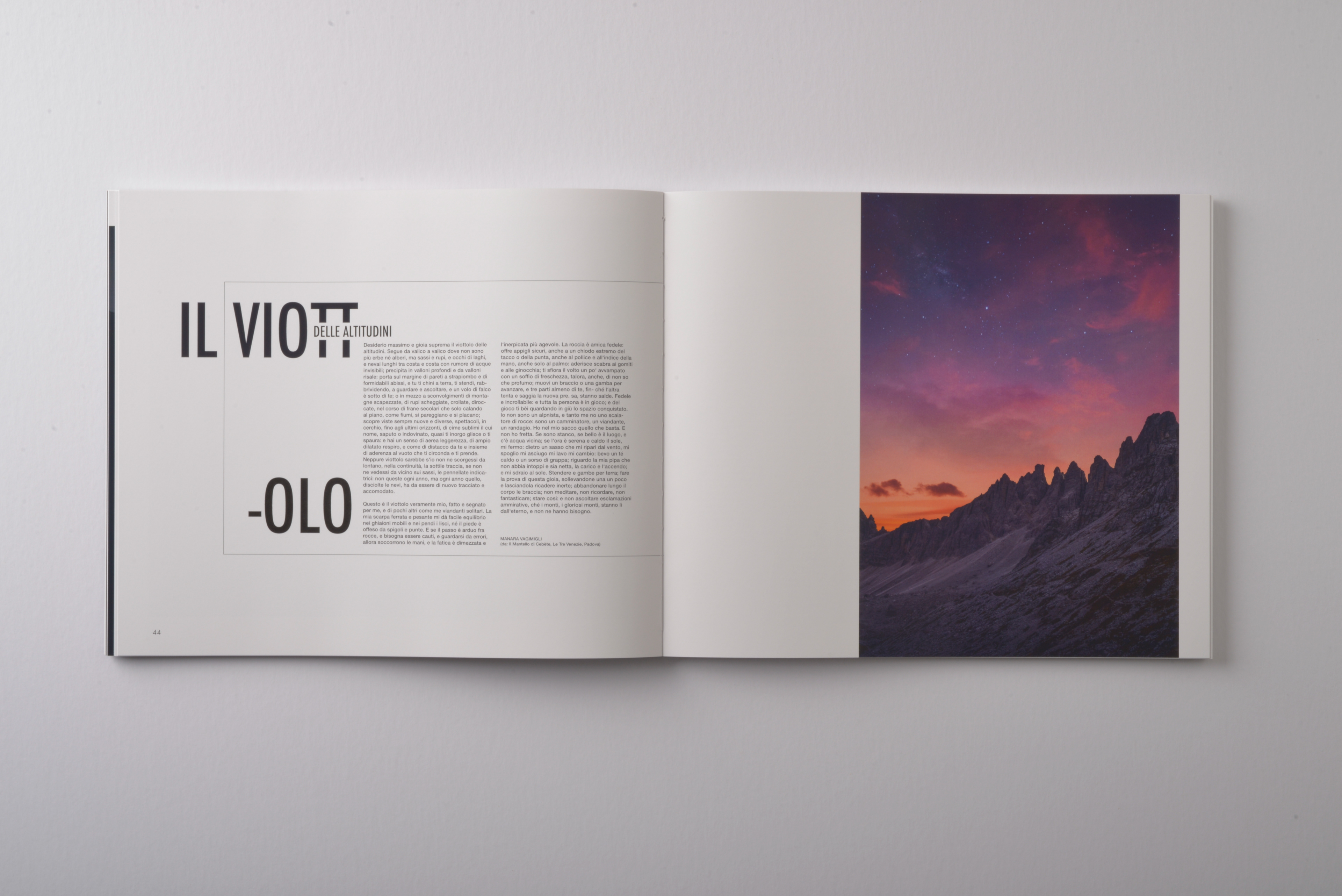
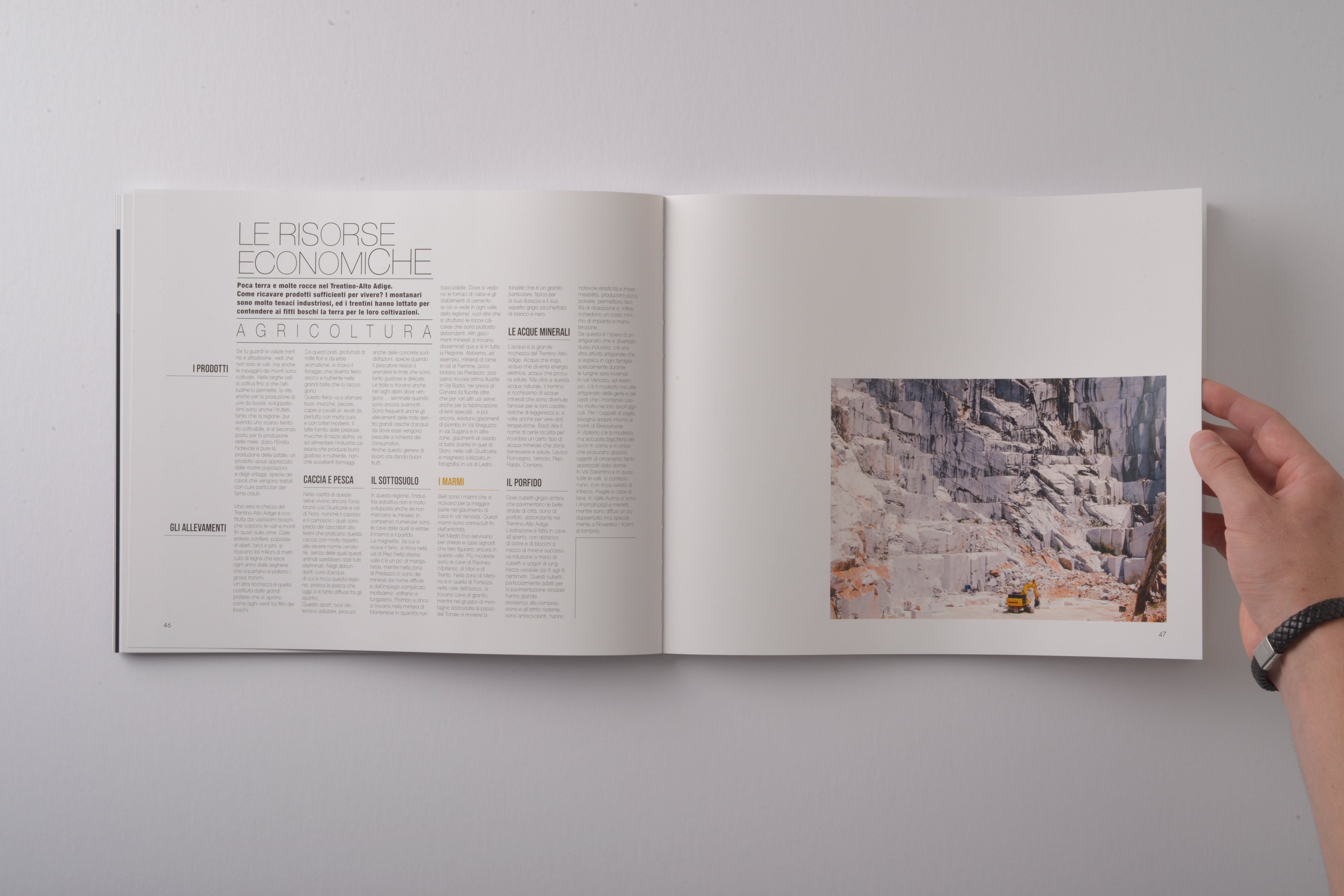
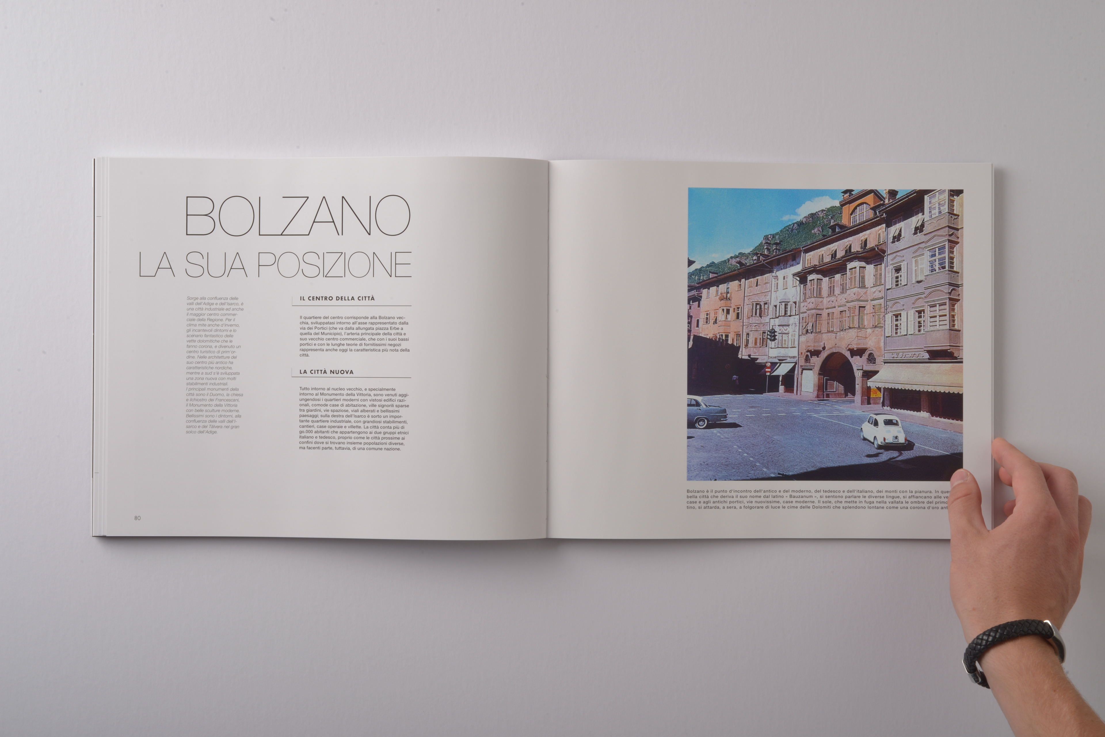
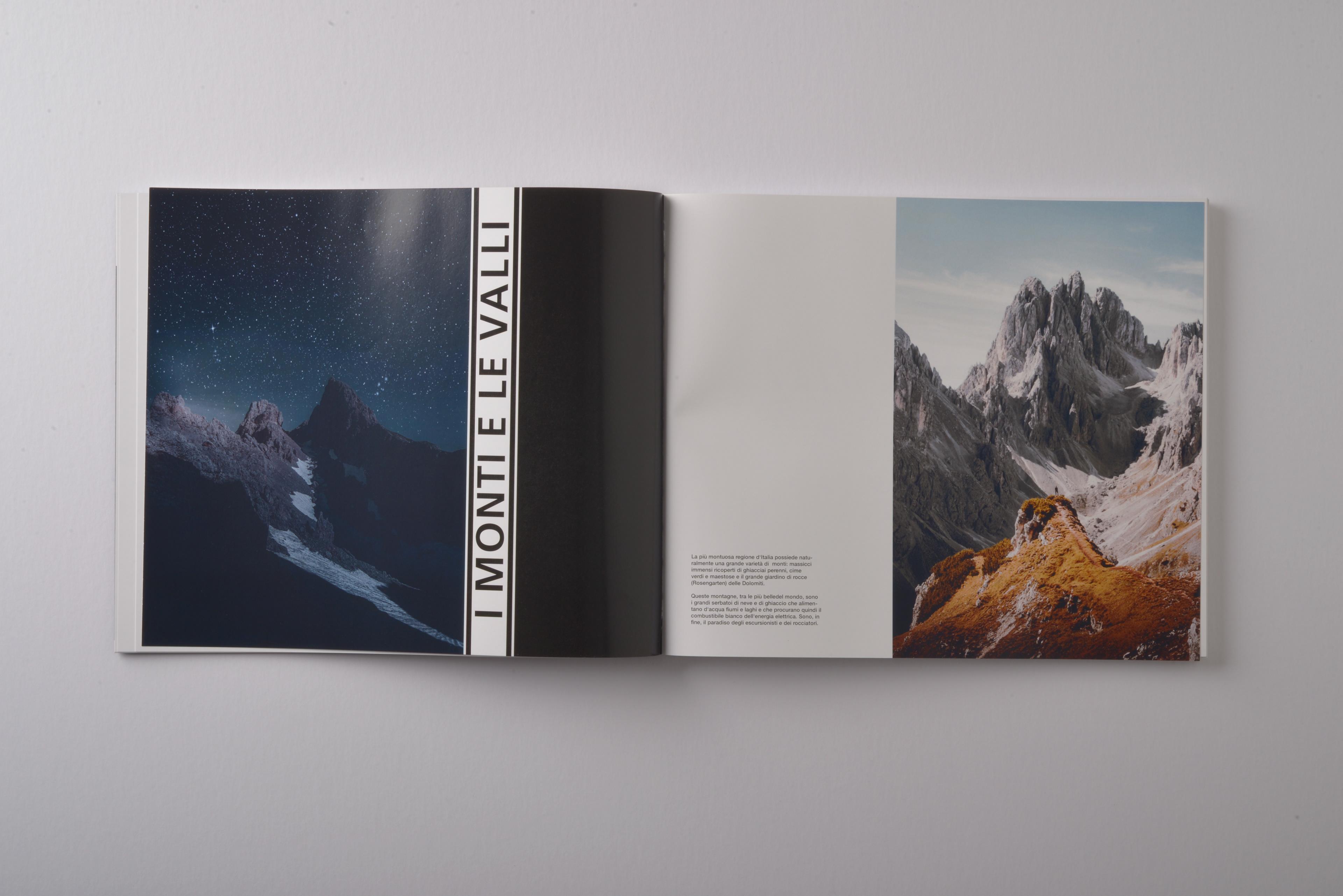
This project was a reinterpretation of the old information book Alla Scoperta del Trentino - Alto Adige. The assignment was to transform an existing book of our choice into a new version, with complete freedom in how to approach it. I decided on a minimalistic design with generous white space, reusing and reworking many of the original images while also integrating new photography. Some pages echo the layout of the old book as a subtle homage to its design. The final publication measures 270 × 320 mm and is hand-stitched with an open Swiss binding. As part of the accompanying exhibition Bücherwelt, I created a laser-cut map of Trentino - Alto Adige, conceived as a complementary artifact to the book.
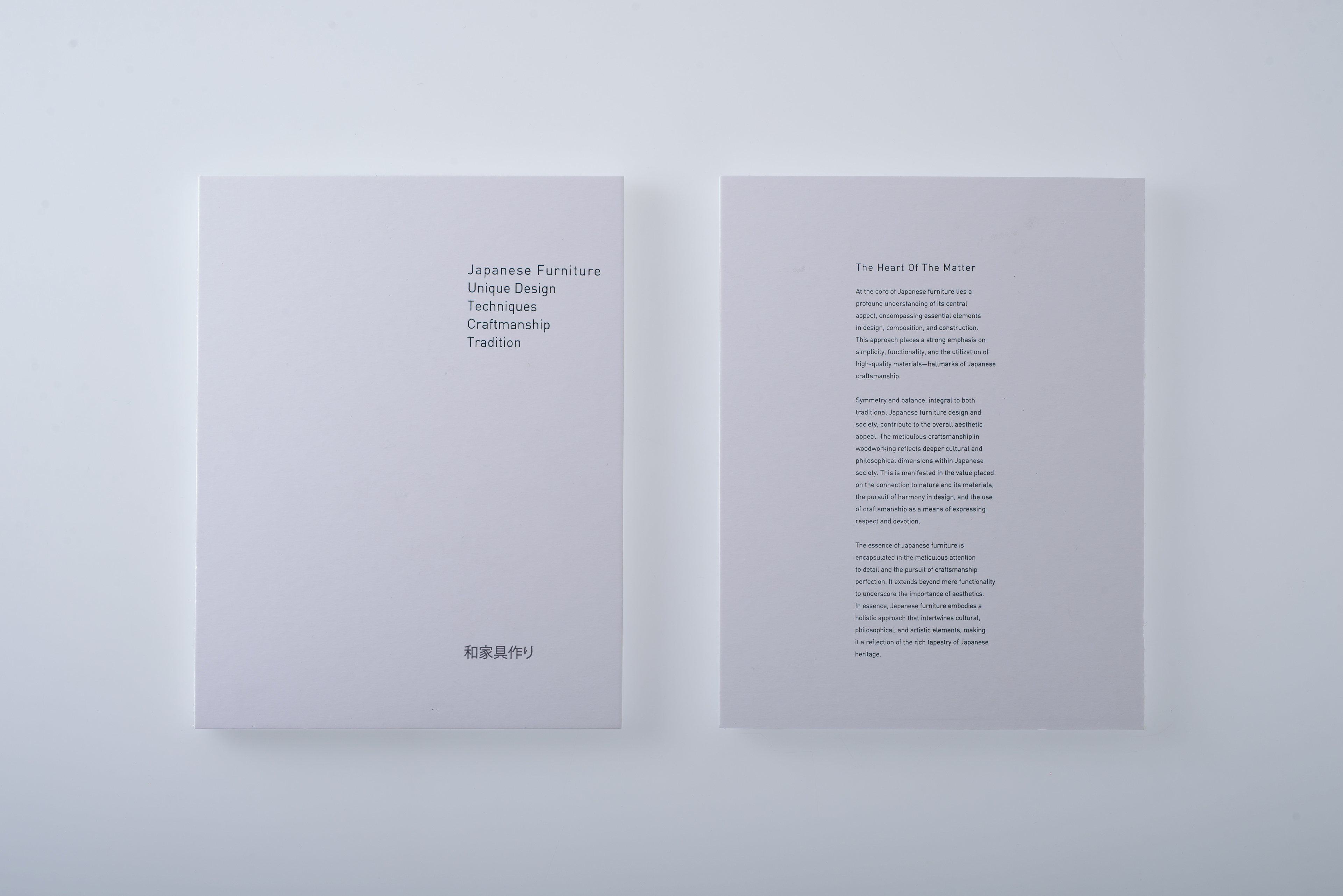
JAPANESE FURNITURE
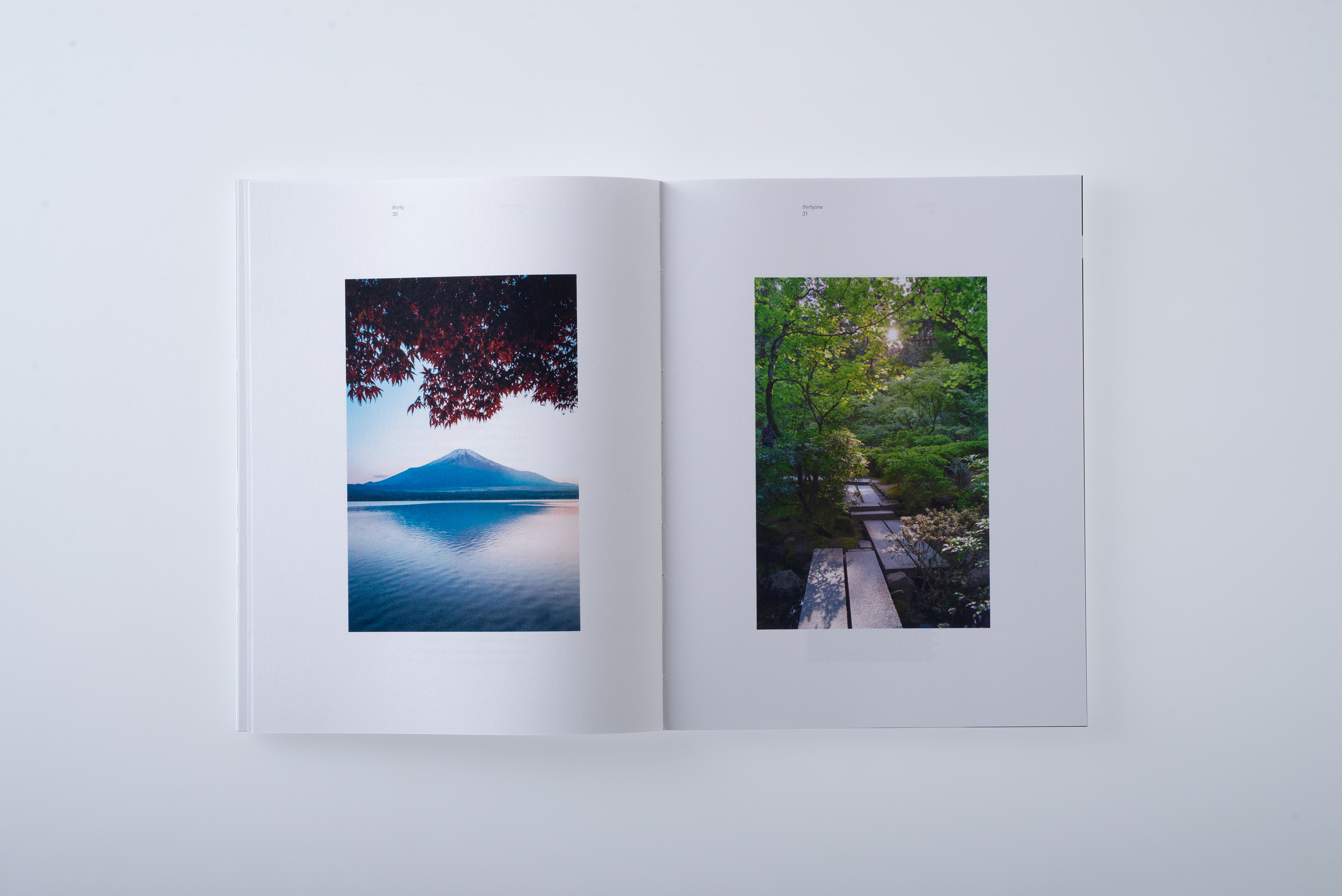
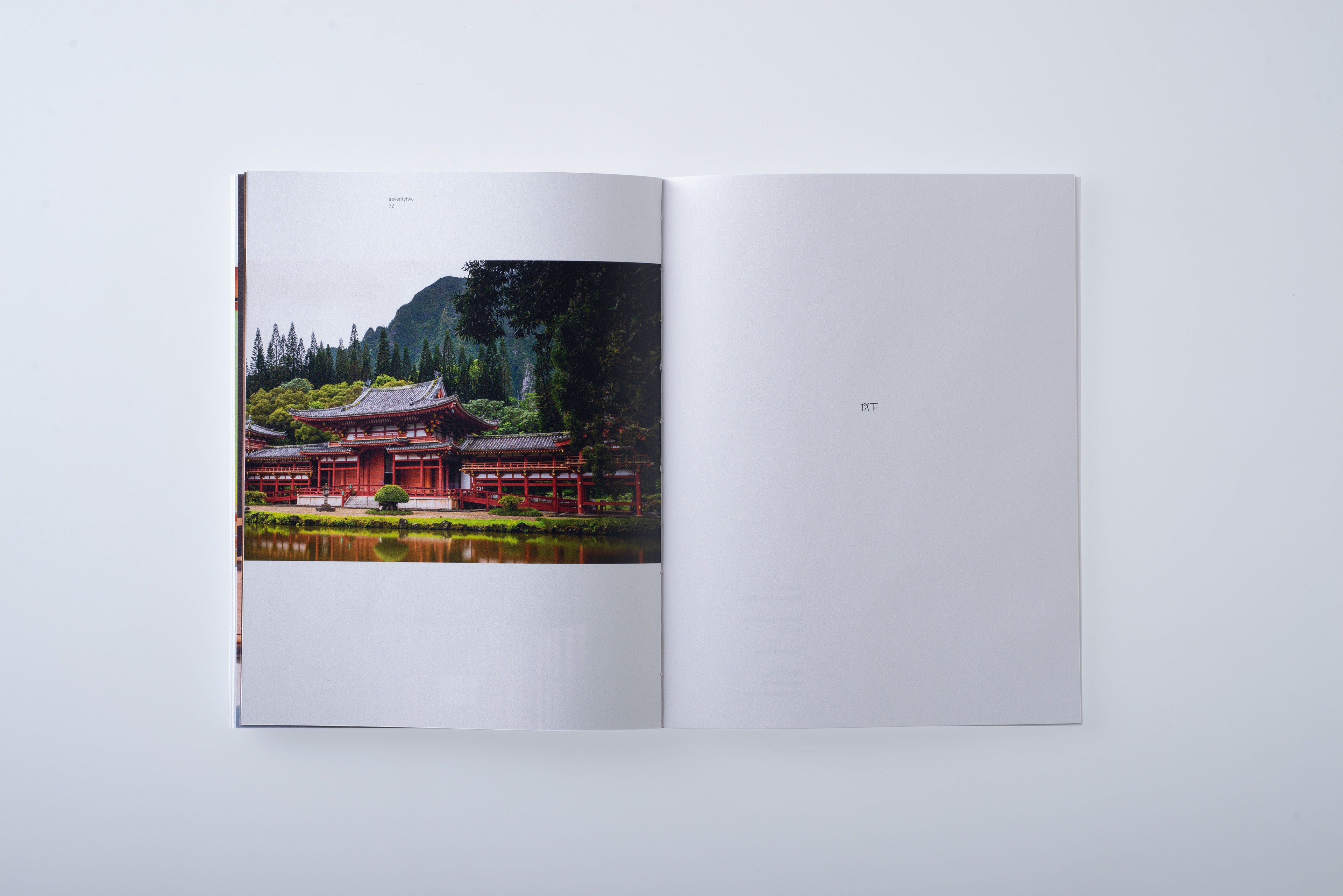
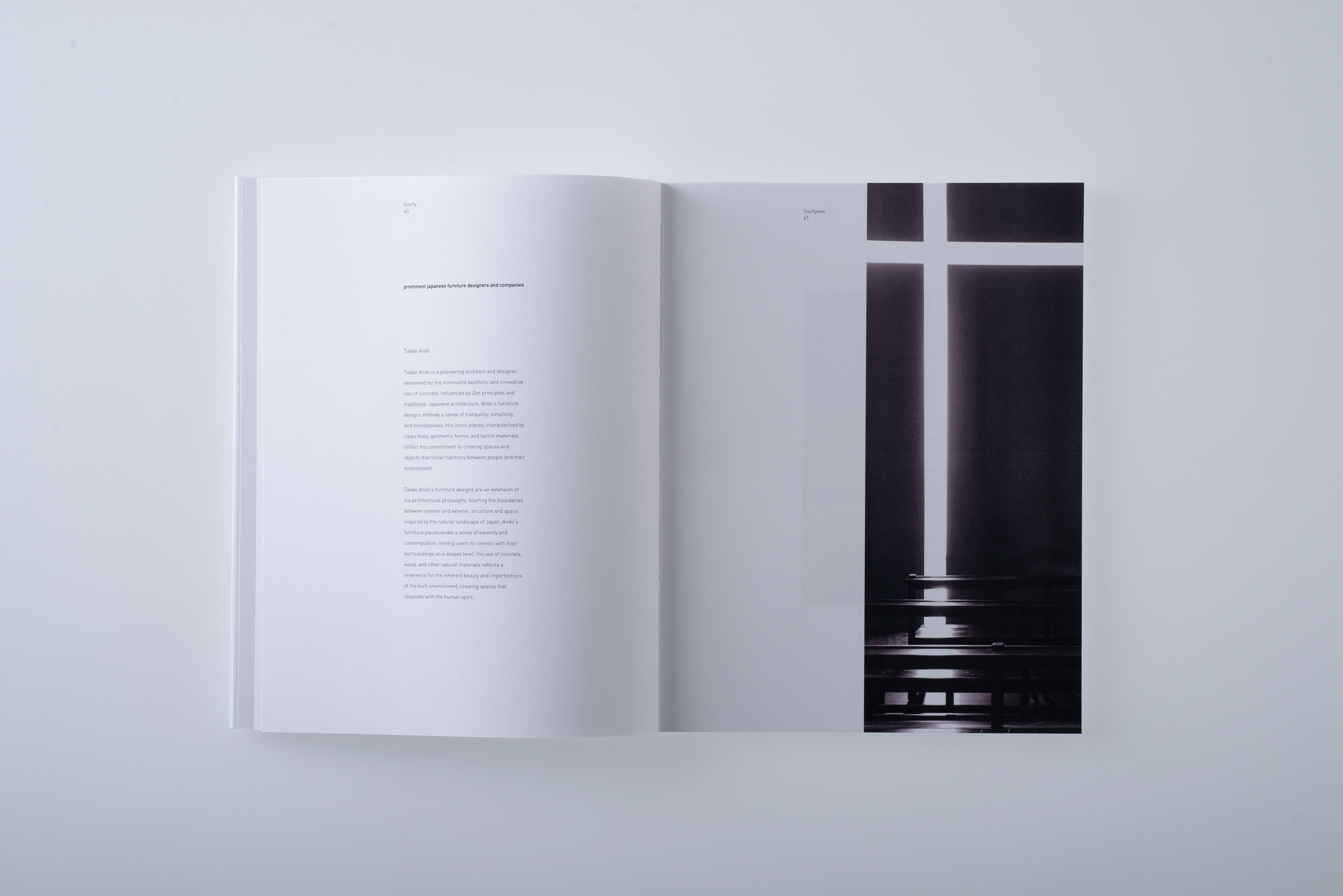
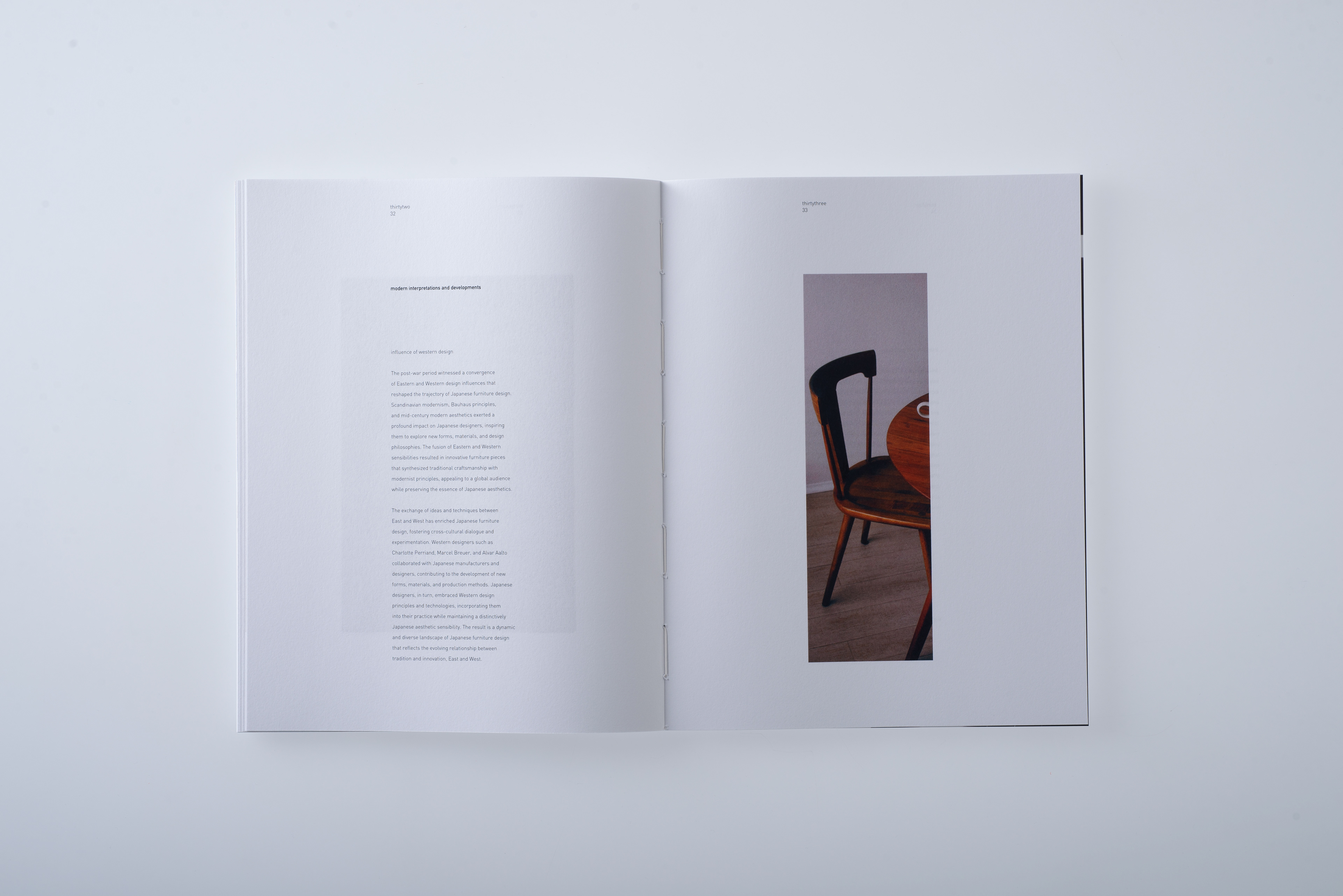
This book provides an in-depth exploration of traditional Japanese furniture, tracing its evolution from prehistoric beginnings to its refined forms in the Edo period. It highlights how centuries-old philosophies and cross-cultural influences shaped a design language rooted in simplicity, functionality, and spiritual depth. Early techniques from China and Korea introduced new forms and structures, while indigenous aesthetics emphasized harmony with nature, modesty, and impermanence - principles deeply connected to Shinto and Buddhist traditions.